importance of drop-down menus
One important element of website navigation to me is the drop-down lists/sub menus (or breadcrumbs) when you visit a site. If not designed correctly, this area of your site could be a mess and frustrate the viewer from finding your information. The article I choose to discuss is called, Designing Drop-Down Menus: Examples and Best Practices by Matt Cronin. In this article, Cronin opens with saying how many web developers and user-friendly enthusiasts are against drop down menus completely. However, he discusses the importance they can have as they serve for a secondary navigation to avoid heavy clutter on the main page. Also for designers, they can be used properly, to help viewers find what they need quickly and to help the site be visually appealing. In a study he provides users found drop-down menus helpful in that there was less “scrolling” on pages trying to find information.
+where to use drop-down menus
The purpose of the drop-down menu is to organize the information into categories which becomes your sub-navigation. For example, in this designers blog off of GoMediaZine.com, his portfolio information is sectioned off from other resources. Another reason for using drop-down menus is for e-commerce sites to display their products.
Another great reason to use them would be for display modules such as obstructive search boxes, or submission forms.
+sub-menus do’s and dont’s
Cronin stresses the importance of how to create the drop-down menus successfully. He states that they should not exceed more than two levels of information. He also mentions two options for designing these menus:
- Option 1: Hover Menu – Hover is when you hover over the category, and the sub menu shows, this is optimal from a designers standpoint.
- Option 2: Clickable Menu – Many argue that clickable menus are better because the user can lose a sub-menu once the mouse has moved from the area.
In either option, the designer must be careful when considering transitional effects, hover sensitivity and delays in their menus. It is also important for web developers to watch that the toolbar does not get in the way of the sub-menu as shown in this picture below. It is recommended that these tips be turned off for this area.
+styling techniques
Cronin gives examples on how to style your menus to fit nicely with the company and to visually coincide with the sites design. He suggests using clean lists rather than long cluttered lists and to check that each section is spaced nicely. He recommends trying a semi-transparent background for the sub-menu for certain designs. An example of a poorly designed sub-menu is shown from the Washington Post website. The text runs into each other.
whirlpool
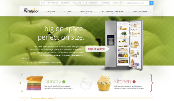
The large company I choose to analyze their navigational features was Whirlpool.com. This site is pretty well designed as it serves the purpose of featuring the products nicely and allowing the user to navigate through each section without getting confused.  The site is also visually appealing. The bar is organized into five helpful sections, each color cordinated. Each category is assigned it’s own color, yet fits into the overall design. The bright colors can resemble clothes for laundry and food for the kitchen. Here is what the homepage looks like on the left, while when you hover over the navigation bar, you see the sub-menu on the right.
A nice example of a product list shown in a hover is seen here in their “kitchen” category below. 
It is also nice how when hovering over the navigation, the menu does not lag and there is no distracting tool tips until hovering over the “learn about” feature. The breadcrumbs take the user to more detailed areas of info. Text links are highlighted from gray to blue when hovered or to the designated colors in the drop-down menu.

The company provides a site search bar on the top left that is always nice to find if looking for something specific. A chat feature, cart and register information can be found subtly on the top above the navigation bar. When asked to sign in or register, a clean page comes up where you can submit your information. 
I believe this site navigation features are intuitive to me. The navigation organization seems natural as I instinctively would look for the laundry and kitchen menus first, and then the other information such as filters and the owner center on the left. I also feel that the small sub-section of information such as the cart is placed very nicely as it is not distracting yet is easily found. I really enjoy being able to find search bars for e-commerce sites on the top left of the homepage. I think its important for major corporations like Whirlpool to provide extra text links and employer information on the bottom after the fold like given on this site. Honestly, I am not sure what I would change for this website, as I feel it is organized pretty well and is user-friendly.


Good job, well written and very thorough! What made you select Whirlpool? Have you been appliance shopping?
Well I was trying to think of major companies with nicely designed websites and I remembered when my sister was appliance shopping recently for her new house. 🙂