good examples
+Think Green Meeting
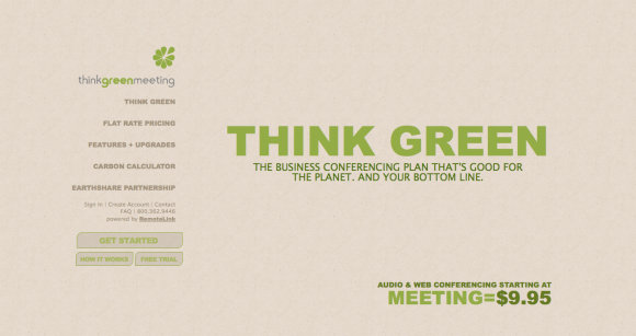
While there were many websites that demonstrated various ways to develop a single page website creatively, I choose to talk about the Think Green Meeting website and the SmartCar website. The Think Green Meeting concept is shown nicely in their single page website. The setup looks like a more traditional website while the SmartCar site scrolls vertically to what seems like forever. When you click on a part of the left navigation (Think Green) the information subtly changes to other information scrolling vertically and horizontally. I believe for the serious tone of this project, the subtle changes are more appropriate. SmartCar is a more playful concept as the car is so small and comes in several bright colors, so their hectic transformations between sections work well for their products. When you enter the Think Green Meeting webpage, you see the headline to the right surrounded by images of cars and planes that disappear when hovered over.
This refers to their idea of “eliminating” your carbon footprint by using less transportation. This is a interactive way to introduce their concept that is to conduct meetings using web and audio rather than traveling. The number towards the bottom that starts off with the average cost of meetings including transportation changes as the images disappear, therefore ending at $9.95 for their membership fee. The colors are highly appropriate as they relate to the “Think Green” movement using natural tones. I think this site is very user friendly for the audience of business people, as they can easily navigate through topics that are highlighted when clicked, and the timing between each section is not too long for the average impatient worker. It is a unique way to state all the company’s information on one single page without being too artsy for the average Joe.
+SmartCar
I wanted to mention the SmartCar website as well because it is a well designed single page website used in an different way from the Think Green Meeting website. SmartCar uses a scroll-down vertical layout that brings you through all the information and vehicles you would need provided by the SmartCar company. I think it is very impressive how a car company could encompass all their information so smartly on a single web page. The typefaces and bright colors go very well with the qwerty stigma of the smart cars.  Their current ad for “Uncar” is repeated nicely throughout the sections of their page in different ways. Another good thing about both of these sites is how the user can always find their way back to the navigation to go “home” or to another section. I find this is important when looking through a website as some of the single page websites do not have options to refer you to another section until the end of the scroll.
poor examples
One of the sites I wasn’t impressed with as a “single page” site was the portfolio of Brad Candullo. I thought this site looked more like just a blog than a designer’s professional website. I also had an issue with the concept of the single page because the only elements that remain on a single page are the three sections in the top right navigation where “About Me” is circled.  The rest of the links below (example, logos, print) bring the user to other pages. I have seen many designer sites that include all their information nicely in a single page document such as, James Garner, and Thomas Pojeta. I also get confused because when I click on “My Resume” and “Email Me” it brings me to the same fragments, as shown below.
O|A|R
I choose to design a site for the band, OAR, (Of A Revolution). The band’s current website is kind of simple and not very intriguing or interactive. It contains a wood texture as the background and uses a four column grid containing all the information in a rather busy manner. There is a nice navigation bar on the top right corner, yet it leads to other pages. I think they would definitely benefit by having a single page website that is designed uniquely with their information. OAR is a fun “hippie-folk” band that started off playing around college campuses in the northeast coast. All the members are relatively young and grew up in Rockville, MD so I think incorporating elements of that would be fun for them and their listeners.


Make sure and proof read. I think you meant to say quirky stigma, but instead you wrote qwerty stigma.
It’s hard to find experienced people in this particular
topic, but you seem like you know what you’re talking about!
Thanks