Author Archives: samanthakategannon

Adv Web Final Blog

Web Advice


+message for myself

Before taking Introduction to Web Design, I was already intimated by the thought of having to actually make a website. However, I didn’t think designing for it would be too difficult, as we had all made Photoshop comps in previous classes for potential websites. Well, I was wrong. I quickly learned that websites required a deeper understanding on how they are made, so that you can properly design for them. In print, you have more flexibility with imagery and graphics rather than web. You can make really awesome sites using animations, JQuery, or even just the right design, but you need to know what is possible and what isn’t. This is the biggest thing I learned in the last two web classes. Now as I look back to my previous website comps for older classes such as Intro, and Corporate I.D., I realize how I could have made a better website using techniques I learned in my web design classes. As far as the technical side goes, I would have to tell myself to really keep up with the new lessons, by writing them out clearly in my notes, and making up my own examples to practice with. Oh and of course, I would have to warn myself that math was coming back into my life, and to just embrace it. Shown here is a little taste of my reactions once we started coding and figuring out navigation, floats, and responsive/fluid designs.

coding + math = ahhh

+advice for future webbies

There are a few things that may help future students planning on taking web classes. At first, syntax may look like another language, but if you give it a chance, it really does make sense in the long run. You have to keep an open mind and believe that you can make a website, even if you aren’t so into the technical side of things. It’s always a good idea to read and practice the lessons that will be covered in upcoming exercises, so you can give yourself time to fix any issues. This brings me to my next tip, you have to realize, something will ALWAYS go wrong. So be prepared, make time and plan ahead, and don’t freak out. If you keep validating throughout your assignments, it will help you keep on top of the site to make sure nothing is set up incorrectly. When there is an error, you can usually find it pretty easily. You have to watch out for typos, and unclosed brackets! Also, firebug, can be your best friend! When I started introduction to web, I really never used it in the way I should have. I then realized in advanced web, that you can actually type in different values and numbers and test out the site, as it would render. You can usually find why something isn’t working with firebug as well.

don't be a victim, keep up with your stuff!

When it comes to design, usability is one of the essential aspects of web design today. Because there are so many different devices and platforms out there, it is crucial to keep in mind how your design with show on a desktop, versus a smart phone. My advice is to check out sites such as this one, 60 Examples of Responsive Design. These blogs will help you understand how responsive design is now a key element to web success. Even if you don’t understand the technical side yet, you can see what is possible visually. Pay attention to how the screen and elements change once the browser is re-sized. Also, there are often times where one-page websites are appropriate. These links, One Page Love, Designerfix, and InstantShift shows some really cool examples or what can be accomplished. Here are two examples shown below of the difference between a one page vertical site, and a one page horizontal site. Check them out!

Vertical site

Horizontal Site

Adv. Web Blog 5

HTML5 Features!


Two topics I choose to research and talk about in HTML5 was, HTML5 audio and video features, and HTML5 form elements. I choose the audio/video feature, as I will be using that in my group project in developing an app. I also was curious in seeing what additional features could be utilized to make forms more interesting.

audio/video

+CoderBay

The first article I found pretty helpful in explaining HTML5 audio and video was CoderBay.com, which provides free web resources. This specific article was short, sweet, and to the point. It delivered the information to me quickly and efficiently. It informed me about JPlayer which is a customizable J-Query player that allows users to play audio and video clips on their webpages. It is a compatible player that allows use for multiple formats such as mp3,mp4, and wmv. The nice thing about Jplayer is it is fairly small in size, being 8kg minified. Jplayer is also available for many platforms.

JPlayer

+WebAppers

Another recent source I found helpful in discussing Jplayer, was WebAppers.com made specifically for web developers. This article explains how Jplayer is a free and open-source media library actually written in Javascript. As Jplayer is a JQuery plugin, you can use any audio/video clips across multiple platforms easily. This article encourages users to gain support and help by using JPlayer’s community forums. It also explains how easy it really is to use JPlayer, and how it can be customized visually by using HTML and CSS, as anything else. A pro about JPlayer is that it has been tested in: Firefox, Chrome, Opera, Safari, IE6, IE7, IE8,  and IE9.

JPlayer detail links

+hotscripts

A handy site I found for JPlayer scripts is, HotScripts.com. This site is awesome for developers looking to find specific/helpful scripts that fit their needs. It is a forum of scripts with titles, details, and even reviews. Each script tells the viewer what it may look like, how it functions, and how many clips they play. It also gives the user the option to visit the publisher’s site. This is really helpful in that once you click on the script you are interested in, you can demo it, download it, or look at any other details and pricing (most are free). For example, below I show three steps in viewing a guitar chord script I chose.

hot scripts homepage listings

publisher's website

guitar chord demo

form elements

+HTML5Rocks

One helpful site I found explaining new form elements in HTML5 was HTML5Rocks. Under tutorials, they have an article, “Making Forms Fabulous with HTML5” by Jan Kleinhart. She talks about many of the features. The new input types and input attributes are given here broken up in a very helpful way for new developers. For example, she explains an input type called “tel” is used for entering a phone number, but explains how it does not set for a specific syntax by itself.

HTML5rocks input types

+w3schools

A site I found helpful in explaining the three main HTML5 form elements is w3schools.com. It explains how not all major browsers support HTML5 form elements, but if they do not, they will behave as regular text elements. This article shows the new main elements as:

  • <datalist>
  • <keygen>
  • <output>

Datalist is used for specifying a pre-defined list for <input> items (options are for different browsers here).

Keygen is used to authenticate it’s viewers.

Output is used to show the result of a calculation, which can be helpful on forms that involve math/numbers.

One con about these features you may notice, is that none of these elements work in Internet Explorer, which is still a major browser to many people today.

+ThinkVitamin

The last site I want to talk about involving HTML5 forms, is thinkvitamin.com. This article, “Fun With HTML Forms” by Richard Shepard is very interesting and helpful. I liked this blog because it was easy to follow, entertaining, and informative. He discusses many more details in HTML5 forms. I found a specific feature I didn’t know how to do before that is resourceful. Shown below, he shows the developers how to include text already in the text field that is there until the user click on the form box. It is fairly easy to do this as you type;

“<input name=”firstName” placeholder=”First Name” required />”.

Basically, as it sounds, placeholder is the text that is set in the text field in gray. The reason for not seeing “text-field” is because HTML5 already defaults it unless otherwise specified meaning, less coding = convenient! With any of the features he mentions, you can make pretty interesting forms that stand out among the many standard ones out there.

placeholder example

Camera+ (Jplayer)

A site I found that uses HTML5 Jplayer is Camera+. This site is for the promotion of the app, camera+ which drastically enhances Iphone photos with one tap. They embedded a Sublime Jplayer video player that has very clear picture, and loads quickly without the delayed buffering. The player is the first thing you see on the page, and allows the viewer to jump into the concept of the app. It also plays on all major browsers including Internet Explorer.

Camera+

Adv.Web Blog 4

HTML5!


What is HTML5?

While I didn’t know too much about HTML5 and it’s capabilities, I did find some helpful information to grasp a better understanding of the features provided. Html5 is the latest version of HTML and possesses many user friendly techniques. HTML5 is well known for it’s optimal performance and convenience. However, like any new program, HTML5 does have some drawbacks.

pros/cons

+pros

HTML5 is helpful when designing a complex site as it’s quicker for the developer to set up for multiple devices. It’s efficient because you do not have to re-code a site for each different device such as tablets and phones. The graphics are also better, as there are more capabilities in HTML5 than HTML4. This version also provides hardware acceleration, as it relys on your device’s built in video power to show videos (lockergnome.com). This allows sites to not rely on Flash, which does not work on devices other than desktop. So far HTML5 works very well for mobile devices, which is a major form of internet now. Another pro is that HTML5 does not require plugins for effects, which in turn provide less hassles. It is also a free way for developers to make HTML5 apps. From my understanding, HTML5 has helped businesses by allowing sites to track it’s visitors and locate the location of the user if they allow so. As you can import graphics, animations, and audio/video clips without added plugins, this helps reduce browser speeds when visiting the site. Another helpful feature is that data can be stored offline, this is very useful for apps when users are in areas of little to no internet connection, as the apps can store the data previously recorded using HTML5. Apps are also seen to be safer from unwanted apps attacking a user’s apps on your mobile device. With a drawing canvas option, graphics are created easily. XHTML 1.0 does not support features such as the video/audio tags that HTML5 does.

+cons

HTML5  currently lacks easy Digital Rights Management control. A major issue with HTML5 currently is that it is not fully compatible on all browsers. As it does prove successful on popular browsers such as, Firefox, Google Chrome, Safari, and Opera, it still has issues with versions of IE. However, with modern technology, it is most likely it will be updated to work successfully across all major browsers.

Sites uses to help in explanation were:

www.html5rocks.com, www.squidoo.com, www.lockergnome.net, www.stackoverflow.com.

HTML5 example

A site that is designed in an interesting way and uses HTML5 is the band, the Killer’s  site that promotes their albums. This site may appear to have the look of Flash, because of the continuous shift of the graphics wrapper. It possesses the animation feeling that Flash can bring, but without the hassle of loading a Flash file. It also works well on many browsers (including IE) and an Iphone. This site is nice because it stays the same on different browsers. It is impressive to see such an animated site like this render correctly on the small screen of my phone. This site not only is aesthetically appealing, but works in a fun efficient way. It allows the viewer to really explore each album individually and find content about the Killers.

first page shown

unique hover effects (the victims)

browser size reduced


Adv. Web Blog 3

JavaScript!


After researching many sites and links about JavaScript, I finally seemed to grasp what it does and how libraries such as  jQuery can bring an engaging edge to your website. JavaScript is a scripting language that programs interactive effects on to a web page. This syntax is relatively simple as many designers can just use a plugin without having to actually program it, and add the effect to their own web page. JavaScript typically gets linked into an HTML page so that a <script> is shown in firebug that holds the jQuery code separately to where it can be used multiple times. There are many pros to using JavaScript that I will briefly mention.

+benefits

  • JavaScript is compatible on all the major and latest browsers such as, Internet Explorer, Firefox, Safari, Chrome and Opera.
  • Plugins can make many user-friendly effects to add interactive transitions that make your site stand out among others.
  • JavaScript can be used to validate form data which saves the computer from extra processing.
  • Reacts quickly and efficiently.
  • It can store cookies so your information is saved when re-visiting the site.
  • Relatively easy way of putting code into your HTML.

*Some benefits found on w3schools.com.

+what to look out for

  • Because of scripts being used for pop-ups and unwanted advertising or surveys, some users/systems disable JavaScript.
  • There may be slight differences between browsers when viewing form the server end verses the client side.
  • Some plugins and transitions are often “too” common and used to the point where the user may be sick of that particular effect. This also may not help to differentiate between web sites. Like design, it’s good to research other pages to see what has been used too much.

Useful Plugins

When it comes to what exactly JavaScript can add visually to your site, there are endless possibilities. Besides the fact that you can write your own scripts if you wanted, there are many scripts to choose from for your web page. On WDL there are ten useful jQuery plugins just for images that can already make your page more dynamic.

+examples

One example I found helpful was, Pickachoose. This effect is especially useful for sites that contain heavy imagery that you want the user to be able to see at large and individually. This would be a smart effect for a portfolio site. One image is shown large while the other images are grayed out allowing focus to the chosen image. This particular plugin comes with a variety of themes to choose from as well.

Pickachoose example plugin

Not only does JavaScript assist with visual effects, but it proves to be extremely useful for other necessities such as text tools, navigation, and forms. One plugin I found on Smashing Magazine is called, Uniform. This is a plugin that allows you to personalize your web page’s forms to be uniformed within all browsers. With this you can have drop-downs and check boxes as you wish.

Uniform

Although many scripts for slide shows exist, one I found on Smashing Magazine  is unique in that it has 16 transition options and is click-able for filtering through the images. This plugin is called the Nivo Slider. As shown below, this plugin is nice for seamlessly showcasing important imagery.

Nivo Slider

A plugin that would be useful for websites such as travel sites like globetrooper, would be the MobilyMap, found on Speckyboy.com. This effect is good for marking areas on a map, making notes, and has a drag-able interface. The new Facebook has a similar feature used for marking travel spots on their time-lime map.

MobilyMap

A simple useful plugin I came across on Smashing Magazine was the jQuery Captify Plugin v1.1.3. This plugin comes in handy when you have a list of images that may need additional comments or captions in a organized grid structure. For example, the band O.A.R.’s website uses this for their album page. This is a nice experience as when I hover over the album imagery, I find out more information like the release year and album name quickly.

pop up caption plugin example

Web Page Critique

A site that immediately came to mind when I thought about JavaScripts being implemented, was the Whirlpool site. As I have spent time viewing their page before, I remember noticing that it was very interactive and had quite a few effects that helped understand their products better. This also made the thought of shopping for expensive appliances a little bit more fun. One effective script they use is the drop down sub-navigation that houses more detailed categories. Although the menus may cover information underneath, it is an interesting addition to the site. They also provide interesting forms and check boxes that help the user find exactly what they need.

drop down menu

check list

Another script they use with their laundry machines is a custom tool tip that hovers over when rolled over each machine. As you can see shown below as “Quick View”. This if clicked brings the user to the next image, a close up of the picked machine.

tool tip

One particular smart thing Whirlpool does here, is that they use plugins that allow for magnifying in on their products. The user can drag and turn them to see the products online better. This could help increase their orders online because of the high quality perspectives and realistic interactivity. If I were purchasing an expensive product like this, it would be helpful to see them to compare them up-close. You can also choose different finishes or colors here. Overall, the JavaScript scripts prove to be a positive resource for this company and many others.

Zoom in feature

Drag-able

Adv. Web Blog 2

Responsive Zen Garden

For the CSS Zen Garden assignment, I am doing a design without following a concept developed from text. In this case, I decided to design something that resembles an urban setting, which was inspired by a recent trip to New York, where I grew up. I would have to narrow down which exact direction to take this idea, either in a “grungy-street art” eclectic setting, or a more scenic direction. Either way, I think I could represent the natural beauty of urban life and the oddness about it.

+moodboard

For my mood-board, I used mainly my own images, a mere handful of my collection of urban photography. I find that many areas in urban settings are truly unique and I tend to find something new on every corner. There are many shapes, lines, and variations in light. I find interest in shadows, old buildings, signage, and random objects. One of my favorite aspects of urban settings is how beautifully nature molds together with man-made construction. My color palette is still slightly up in the air. I think it would be cool to use mainly black and white (or neutrals of the sort) and then use an added color for dramatic flare, for example one of the few in my mood-board, yellow, red, blue, or green. It will be an interesting challenge designing for a completely open topic site, keeping responsive design in mind as well.

moodboard

Adv. Web Blog 1

Responsive Web Design


Over the past few years, one of my favorite things to do when I look at websites has been to adjust my browser size to see if any alternative transitions occur, which is in fact responsive web design. I always thought it was really cool when a website could change formats for different screen resolutions, it is a nice effect and pretty essential today as web development is constantly changing on different devices.

plans for change

+fluid grids

As of now with my current design of my final introduction to web design project, I would have to change things in order for my Animal Cracker website to work responsively. To do this, I would need to use a fluid grid and figure out a percentage value for my the image width. According to Nick Pettit, in the Beginner’s Guide to Responsive Web Design, this calculation can be done by diving your target element, in my case I went with dividing 320px by the standard 960px grid width, and then multiplied by 100 giving me, 33.33% for my width.

+media queries

In addition to a liquid layout, media queries are important in responsive web design as they are used to set the variations in resolutions simply. Using CSS3, you can have many style sheets for different media queries, and organize them together in one single style sheet, as suggested by Kayla Knight in Responsive Web Design, What It Is and How To Use It. Here is an example given in this article to demonstrate min-width and max-width media queries for the iPhone and iPad.

example from Responsive Web Design/Kayla Knight

animal cracker time

As mentioned before, I had to showcase a plan for changing my current website into something that responds to multiple widths. In my example, I choose to show the change on my homepage from the standard 1024px width to 320px width, which is the screen resolution for an iPhone.

desktop resolution to iPhone resolution

Then to show what it might look like on a tablet or iPad, I included the middle variety as shown below. In my case the way I designed my particular site, I would not have any drastic changes. The text may shift below but the top would most likely look similar.

the left is shown when the browser is left to about 1280px, while the middle is the iPad standard, 1024px, and the third 320px

My changes minimal are similar to that shown in an example from an article, Responsive Web Design: 50 Examples and Best Practices by Adrian. In their first example, the site for Simon Collison is shown. His site does not change too much in the second step as mine would, but does in the smallest form (shown below).

Simon Collison

In other instances, like in the site of the Forefather’s Group, their three instances look completely different (shown below). Overall, they are all interesting ways of changing your design to be unique and work effectively on multiple devices. The challenge is in getting the technical skills down so that the transitions may work smoothly and be work efficiently for the viewers.

Forefather's Group

Web_Blog Post 8

For this open topic blog, I chose to share a website I found along the way while researching websites for previous blogs. The site is called, JennyandGrayden. It is a site not made for a business or a design portfolio, but for a “just for fun” reason. The site is to inform people of this couple about their wedding day and how the couple met, and no I don’t know these people but their website is awesome and I have been waiting for a reason to share it. It’s a nice entertainment factor as it gives brief information about the plans, and the wedding party. So lets start with talking about the visual aesthetics in each section and how some techniques used could be beneficial for contemporary web designs.

Grayden & Jenny webpage as first opened

visuals & divisions

+navigation

This site is formatted as a single page website with a navigation that constantly follows the viewer while scrolling by staying at the top of the page for easy access. The sections are also styled with a script that allows each menu option to softly jump into each section giving a nice effect. This technique is good especially for single page sites to help the viewer switch sections easily. It also works well when the navigation menu is something simple like this:

navigation menu

If guests want to RSVP, there is a drop-down menu that pops up to allow you to submit a short form.

RSVP drop-down

+opening

Something nice about the opening space is that it is designed so that when the window is re-sized down, it adjusts nicely to where you can still make out the idea of the site until it reaches a minimum width. For example, both images seen here are at different screen resolutions.

686 px wide

656 px wide

+our story

When we scroll down to “our story”, there is a paragraph each for Grayden & Jenny, as well as a graphic timeline of their relationship. It also explains the small graphics that represent the couple, the green “J” and red “G”. One negative element people might see is that if you look closely the text has a slightly pixelated and fuzzy background as it was brought in as an entire graphic and probably got condensed in saving. Therefore, if you try to highlight the text you can’t. However, because this is a site for personal purposes and enjoyment, this isn’t a big deal.

"our story" graphic section

+photos

This section visually speaks for itself. It simply contains a script with photos you can click through of the couple’s engagement photos. It is fun and brings a sense of humor to the page. The colors from their outfits even match with the palette and modern-clean feel of the website. There is also a part below the photos where you can jump to a particular photo number, and there is a cited link for the photographer. This is important for web designers to properly cite where credits are needed. I also prefer this script for photo galleries as when the viewer clicks on the arrows, the image just moves quickly rather than loading and expanding full screen. I also think it is important to be able to jump to a certain image instead of having to go through all of them over again.

photo script

number options

+groomsmen/bridesmaids

The next two sections are scripted with different content each related to a groomsmen or bridesmaid. There is a different photo with each person to the left, and a synopsis of the relationship. It is also nice visually to see these playful “bobble-head” figures and the colors of the green and red integrated cleverly again.

bestman

maid of honor

+when, where, & how

This section is probably the most useful for guests. It provides a straightforward area for displaying the time and location of the wedding as well as the directions, hotel info, and parking info.

when, where, how

+gifts

The final section holds a letter and link for gift registery information. There is also a nice photo of the couple in a sunset that fills the container and window. This also adds a nice touch and pop to the site visually.

gifts

writing rules

Even though the purpose of this website is not to sell or advertise a product or company, it still has text to inform readers about the even and the couple. Therefore, the ten tips “writing for the web” should be applied here as well. I will go over briefly how the first five steps are demonstrated with this site using the above visuals as references.

  1. Who-What-When-Where-Why-How: As shown above, the first thing you see as visiting this site is the bold header, “Grayden & Jenny invite you to their wedding celebration, 3.26.2011.”. This pretty much gives the viewer a quick synopsis of what the site is about, the Who, What, & When. As you scroll and read further you can find the Where, Why they fell for each other, and How to for parking info and such.
  2. Less is always more: This idea of cutting unnecessary type and overwhelming information is pretty evident as there isn’t too much text and the text given is very relevant to the event and couple.
  3. Avoid sounding like an infomercial: This is relate-able directly from number two, as you don’t want to have too much information, you also do not want to sound like a cheesy infomercial with the text you do provide. This site’s content is easily readable and pretty interesting. It’s slightly personal and fun.
  4. Make copy easy to scan: Like mentioned before, there is not too much copy on this site, and the copy provided is pretty easy to scan as the paragraphs given are very small and broken up with larger leading.
  5. Write killer headings: As stated in number one, there is bold headings that help the viewer to scan easily.
    one of headings (all follow same style)

Web_Design Blog 7

The site I chose to dissect is ironically a website for a company that builds websites for businesses and such. The site is called, CodeGreen. The design of this site is fairly simple, not too complex but intrigues the visitor with the comparison of “growing” a website using visuals of a growing plant. It is nice to see the three steps with the plant graphics. Your eye goes to the most important part of the page (the synopsis of the company) which is important, therefore the hierarchy works well. The site structure is organized in a three column grid. Visually this site is very clean, the type is simple and has an organic feel without being a display font. The design is very relevant to the goal of this site, which is to code and develop websites for people.

Code Greene homepage

html

The organization for this site in the syntax is pretty well organized and labeled. The main page is divided into four divs and three scripts. Inside the four main divs, there are other divs nested inside with other elements. Below shows the overall breakdown of the HTML for the main page:

  1. This div is just for the top whitebar that the navigation hangs from.

    top whitespace div

  2. This div is called, “nav-wrapper” which contains the navigation in an unordered list.

    navigation ul div

  3. The third div contains the bulk of the information, which is labeled “wrapper” and this holds the logo that uses image replacement. There are several divs nested within this one, including “box-630” that has a div that has a class for the arrows that change when each box is clicked, this also contains the three text boxes. There is a footer div nested in as well that contains the copyright information and a facebook link.

    wrapper div

  4. The final main div is more for the visuals, it is the “shadowbox-container” that holds two divs, with multiple divs nested inside. This is for the shadows on the graphics in the navigation bar.

When you go into some of the other pages on their site, the HTML organization changes a little. As more content is provided, there are more divisions. For example, I will talk about the differences in the page, “skills”. So the main setup is the same, we have four main divs and the three scripts. Once we look into the wrapper on this page, there are different divisions. One is called “box-834” which when opened has two divisions, one “left” and one “right”. Each section of this website has the size  in the labeling, for example the left division is called, “left-639” and this content size is 638 pixels. This helps very much in showing someone how big each section is to fit in the screen.

content from "skills" page

css

For the CSS there are three linked style sheets located in the head. The first one is for the resets, the second is for the main content, while the third is for forms. In the CSS they style classes, divs and unordered lists mainly. They use absolute positioning for the plant images, relative positioning for the wrapper, and for the title they use a display block. The block display is important when using image replacement rather than display inline. In the page, “skills” there is a division specifically for clears after all the title headings, that use image replacement. This helps with their floats.

example of a floated-left for subnav in their CSS

For instance, their sub-navigation has a float: left. All the floats that I have noticed in their CSS are set up for left. This keeps a consistency in the content, as everything is organized neatly and is aligned within the white framed boxes. The padding and margins are all equal in the divs. There is also a separate style for the gradient effect on the green graphic for visuals. Overall this site is organized nicely, and is a good example of what the company intends to provide for their clients.

Web_Design Blog 6

visual inspirations

For the website I will be building on the statistic, “There are 18 different animal shapes in the [Barnum] Animal Cracker Zoo” I wanted to design a site that was going to tribute animal crackers as a classic treat that may remind adults today of their childhood. I struggled with directions for visuals but I would like to do something playful, not too crazy, and find a way to mix contemporary elements of design from today with vintage elements to tie into old age of animal crackers. Because my statistic relates to the Barnum brand specifically having 18 cracker shapes, I needed to think of how to mesh together my design with their distinct packaging. Currently my plan is to create a “logo/headline” for the statistic and use a design with hues from the vintage Barnum color palette on a very light background. For the “about” page I think I can then input the Barnum picture from their vintage/collectors set and add a buy merchandise link that links to Barnum Animal Crackers. Because this site is not about trying to promote a new product but celebrate a classic treat, I think I can get away with this. My mood board is being used to inspire some playful ideas using pops of colors and styling. For type treatments I think the “Combine” logo works well mixing a slab serif with a sans-serf typeface that mixes an older style with new. I think something like this could work well for my site. A site that I came across that uses this idea pretty well is etc.com. They have a primarily black and white website with hand rendered illustrations of western style elements and then added small uses of bright colors while mixing typography styles. A site that I found that had interesting typography using texture and color against a white background was Abel&Cole.com. One last visual I wanted to point out was a packaging design I found for facial scrubs. The brand is Avelet and I really enjoyed their packaging. The pomegranate example shown is a clean design with a hint of color and hand rendered ink drawings that give a light organic feel to the product. Because animal crackers are supposed to be a more nutritional substitute for a cookie, I think this idea could work for my site.

structural inspirations

I have found some sample websites that are visually appealing and have different structures I could see myself using for this website. The revolver website was set up nicely, specifically the header because the bold logo sits in the middle and grabs the user’s attention while the nav sits conveniently right below it. Another approach to branding and navigation is not centering and to set the information off balance like shown in the Capital Awards 2011 site. This site is also very clean and uses their logo, soft textures, and one color for visuals. One site I found to be structured in a similar container size as to what I want to design mine like is Linneaslights.com. The natural hues with colors work nicely as well.

Lastly, as the visual aspect of the home page, I would like to use imagery for secondary focus to go along with the statistic. I also want to add some small content to tell the user what this site is about.  Below are two examples of websites using a central focus on their homepage with minimal text.

Web_Design Blog 5

good examples

+Think Green Meeting

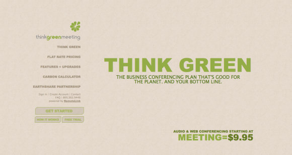
While there were many websites that demonstrated various ways to develop a single page website creatively, I choose to talk about the Think Green Meeting website and the SmartCar website. The Think Green Meeting concept is shown nicely in their single page website. The setup looks like a more traditional website while the SmartCar site scrolls vertically to what seems like forever. When you click on a part of the left navigation (Think Green) the information subtly changes to other information scrolling vertically and horizontally. I believe for the serious tone of this project, the subtle changes are more appropriate. SmartCar is a more playful concept as the car is so small and comes in several bright colors, so their hectic transformations between sections work well for their products. When you enter the Think Green Meeting webpage, you see the headline to the right surrounded by images of cars and planes that disappear when hovered over.

This refers to their idea of “eliminating” your carbon footprint by using less transportation. This is a interactive way to introduce their concept that is to conduct meetings using web and audio rather than traveling. The number towards the bottom that starts off with the average cost of meetings including transportation changes as the images disappear, therefore ending at $9.95 for their membership fee. The colors are highly appropriate as they relate to the “Think Green” movement using natural tones. I think this site is very user friendly for the audience of business people, as they can easily navigate through topics that are highlighted when clicked, and the timing between each section is not too long for the average impatient worker. It is a unique way to state all the company’s information on one single page without being too artsy for the average Joe.

+SmartCar

I wanted to mention the SmartCar website as well because it is a well designed single page website used in an different way from the Think Green Meeting website. SmartCar uses a scroll-down vertical layout that brings you through all the information and vehicles you would need provided by the SmartCar company. I think it is very impressive how a car company could encompass all their information so smartly on a single web page. The typefaces and bright colors go very well with the qwerty stigma of the smart cars. Their current ad for “Uncar” is repeated nicely throughout the sections of their page in different ways. Another good thing about both of these sites is how the user can always find their way back to the navigation to go “home” or to another section. I find this is important when looking through a website as some of the single page websites do not have options to refer you to another section until the end of the scroll.

poor examples

One of the sites I wasn’t impressed with as a “single page” site was the portfolio of Brad Candullo. I thought this site looked more like just a blog than a designer’s professional website. I also had an issue with the concept of the single page because the only elements that remain on a single page are the three sections in the top right navigation where “About Me” is circled.  The rest of the links below (example, logos, print) bring the user to other pages. I have seen many designer sites that include all their information nicely in a single page document such as, James Garner, and Thomas Pojeta. I also get confused because when I click on “My Resume” and “Email Me” it brings me to the same fragments, as shown below.

O|A|R

I choose to design a site for the band, OAR, (Of A Revolution). The band’s current website is kind of simple and not very intriguing or interactive. It contains a wood texture as the background and uses a four column grid containing all the information in a rather busy manner. There is a nice navigation bar on the top right corner, yet it leads to other pages. I think they would definitely benefit by having a single page website that is designed uniquely with their information. OAR is a fun “hippie-folk” band that started off playing around college campuses in the northeast coast. All the members are relatively young and grew up in Rockville, MD so I think incorporating elements of that would be fun for them and their listeners.